How to Design an Album Cover
You will be able to brief or build a cover that reads at phone size: one image idea, clear type, a limited palette and a file your distributor will accept.
Guide·6 min read·With exercises
How to design an album cover that works at thumbnail size
To design an album cover, choose one idea that carries the mood of the music, build a square image around a single focal point, set the title and artist name in at most two type sizes, limit the palette to two or three colours, and check the result shrunk to the size of a phone thumbnail.
Most people will first see the cover at about the width of a thumb, next to dozens of others. Detail disappears at that size. Shape, contrast and colour survive. Design for the small view first and the large view takes care of itself.
A cover is also a file with requirements. Stores want a square image at high resolution and reject some content. Read your distributor’s current artwork rules before you start, not after. Doing it first saves you from rebuilding a finished design around a rule you missed.
Start with one idea
Write down three words for how the project sounds and one object, place or person that stands for it. A tape about night shifts might be "tired, warm, stubborn" and an empty bus seat. That single picture is the cover. Two ideas on one square cancel each other.
Collect ten covers you like from any genre and name the one idea behind each in a sentence. Then write the sentence for yours. If it needs the word "and", cut it down.
Look at what other releases in your style are doing, then decide whether to fit in or stand apart. If every cover in your lane is dark and photographic, a bright flat illustration will be noticed, provided it still suits the music.
Compose for a square
The format is always a square, so composition is simple: one focal point, placed in the centre or on a third, with empty space around it. Empty space is not wasted. It is what makes the subject readable when small.
Keep important elements away from the edges, since some apps crop or round the corners. Decide whether the image is a photograph, an illustration or type alone, and stay with one treatment.
- One subject, large enough to fill a third of the square or more
- A clear light and dark separation between subject and background
- Nothing essential in the outer five per cent of each edge
- One texture or effect at most: grain, blur or halftone
Type hierarchy: two levels
Decide which matters more for this release, the title or your name, and make that one clearly larger. The other goes smaller, in the same typeface or a plain companion. Two levels are enough. A third line, such as a track list or a slogan, will not be readable.
Choose a typeface that matches the mood: heavy sans serif for hard records, a serif for reflective ones, hand lettering for something personal. Place the text over a calm area of the image, or leave it off entirely if the picture is strong, since stores show the title beside the cover anyway.
Letter spacing and case do a lot of work. Wide-spaced capitals feel calm and expensive; tight heavy capitals feel loud. Whatever you choose, keep text at least a finger’s width from the edge at thumbnail size.
Colour: pick three and stop
A limited palette makes a cover recognisable from across a room. Choose one dominant colour for most of the square, one secondary and one accent used only for the most important element. Black and white count as colours here.
Contrast matters more than hue. Turn the image to greyscale: if the title and the subject still stand out, the palette works. Check the cover against both a white and a black background, because apps use both.
Colour also sets expectation. Warm reds and oranges read as energy, cold blues as distance, washed-out tones as memory. Match it to how the songs feel, and keep the same palette for the singles so the releases look related.
The thumbnail test
Shrink the cover until it is about two centimetres wide on your screen, or view it on your phone at arm’s length. Ask three questions: can you tell what the image is, can you read the larger line of text, and would it stand out between two other covers?
Put it in a row with screenshots of five covers from your genre. If yours blends in, raise the contrast, enlarge the subject or simplify the background. Repeat the test after every major change.
Show it to someone for three seconds, take it away and ask what they saw. If they describe the idea you wrote down at the start, the cover is doing its job.
File and rules
Export a square image at the largest size your distributor asks for. Many stores currently ask for around 3000 by 3000 pixels in JPG or PNG, but specifications change, so check the current page. Keep a layered working file as well.
Stores commonly reject covers with web addresses, social handles, prices, logos of other brands, blurry images or text that does not match the release title. Only use photos and artwork you made or have permission to use.
Save the final file with a clear name that includes the release title and the pixel size.
- Square, high resolution, in the colour mode your distributor names
- Title and artist name spelled exactly as in the release details
- No contact details, pricing or third-party logos
- Explicit imagery avoided or flagged according to the store’s rules
Build a mood board without copying
Before you open any design tool, collect 15 to 20 reference images in one folder or on one page. Covers are allowed, but most of the board should come from elsewhere: film stills, shop signs, old flyers, sports photography, family photos. References from outside music lead to covers that look less like everyone else’s.
Sort the board into three groups: colour, lettering and subject. Then write one line under each group saying what the images share, for example "faded orange and green" or "hand-painted capitals". Those three lines are what you take forward. The images themselves stay in the folder.
The test for copying is simple. If someone could name the single cover yours comes from, it is too close. Borrow a quality from several sources and never a layout, a pose or a logo from one.
Source photos, fonts and graphics you are allowed to use
Every element on the cover needs a clear origin. The safest material is what you made: your own photo, your own drawing, your own handwriting. For anything else, find the licence, read it and save a copy with the project files. This is general guidance, not legal advice.
Free stock photo sites allow commercial use for most images, but check each image page, and remember that thousands of other releases can use the same picture. Creative Commons images often require credit or forbid commercial use or editing. Fonts have licences too: one that came with your computer or from a free font site may not cover a release you sell.
- Your own photo of a person: get their written agreement to appear on the cover
- Stock photo: save the licence page and the download date
- Creative Commons image: follow the exact terms, including credit, or choose another
- Font: confirm the licence allows commercial use on artwork
- Commissioned art: agree in writing where you may use it, including merch and adverts
- Never: screenshots from films, brand logos, cartoon characters or photos of celebrities
Rap cover conventions, and when to break them
Listeners read genre from a cover in under a second. Certain looks are common in rap: a direct portrait with the artist looking at the camera, a childhood photo, a street or building from home, a parental advisory mark, heavy capitals or hand-drawn lettering. Used well, they tell a new listener what kind of record this is.
The risk is a cover that says only "rap" and nothing about you. Keep one convention so the genre is clear and change one thing nobody expects: an unusual colour for the style, an off-centre subject, a texture such as scanned paper or film grain laid over a clean photo.
If you are learning how to design an album cover for a first release, do this exercise. Describe a typical cover in your lane in five words, then replace two of them. "Dark, portrait, city, night, capitals" could become "pale, portrait, kitchen, morning, capitals".
One look across singles, the project and promo
A release is rarely one image. Two singles, the full project and a month of posts can mean ten or more graphics, and they should look related at a glance. Decide on the system once: one typeface, the same palette and a fixed position for the title.
For singles, keep the layout and change one variable. The same photo in a different colour wash works, and so does a different crop from the same shoot, or a different object in the same style. In the album cover generator, reusing the same style and similar wording for each draft keeps a set close, though results will vary and you should expect to make a few.
- Store cover: square, commonly 3000 × 3000 px
- Square social post: 1080 × 1080 px, made from the cover without changes
- Vertical story or short video frame: 1080 × 1920 px, cover in the middle, background extended
- Video thumbnail or banner: 1920 × 1080 px, subject on one side and title on the other
- Profile picture: check that the cover still reads inside a circle
Preparing the cover for print
Screens and printers handle colour differently. Stores want RGB files. Print shops usually want CMYK, and bright blues, greens and oranges can come out duller on paper. Ask the printer for a proof, or print one copy first, before you order a run.
Size matters more in print. Printers usually ask for 300 pixels per inch, so a 3000-pixel cover prints sharply up to 10 inches wide. That is enough for a CD insert at about 12 centimetres, but a 12-inch vinyl sleeve needs roughly 3700 pixels or more. If vinyl is a possibility, build the artwork larger from the start, because enlarging a small file later softens it.
Printers also ask for bleed, extra image beyond the trim line, often 3 millimetres on each side. Keep text and faces well inside the edge, and request the shop’s template before you finish the design. A cassette insert or a poster has different proportions from a square, so plan which part of the image can be cropped or extended without losing the subject.
Three mistakes people make designing an album cover
Designing at full screen only
A cover that looks rich at poster size can turn into a grey smudge in a playlist. Checking it small from the first sketch prevents an hour of polishing details nobody will see.
Too much text
Track lists, producer credits and slogans all compete with the title and none can be read. That information lives in the release details. The cover needs two lines at most.
Using images without permission
A photo found online or a famous character can get the release rejected or removed later. Shoot your own, commission an artist, or generate original artwork.
How to design an album cover today
- 01
Write the brief (5 minutes)
Note three mood words, one subject, three colours and which is bigger, title or name. Keep it to four lines. This is the brief for you, a designer or a generator.
- 02
Generate drafts (8 minutes)
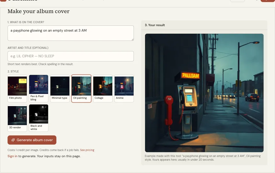
Open the album cover generator, describe the subject and mood, pick a style and add the title as optional text. Each image costs 1 credit and usually takes under 20 seconds. Make two or three.
- 03
Test and check (5 minutes)
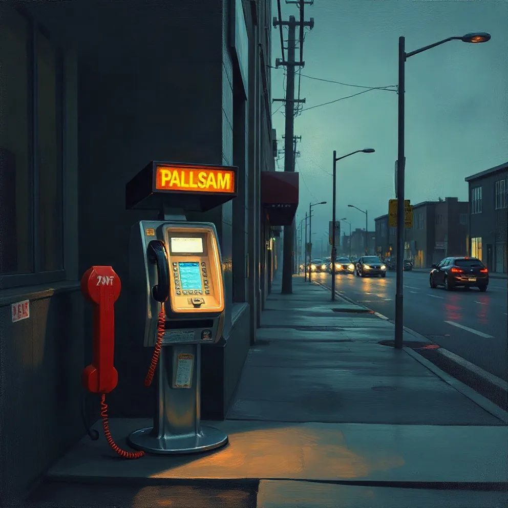
Shrink each draft to thumbnail size and view it in greyscale. Read every letter of any text, because AI can misspell words on images. Compare the winner with your distributor’s artwork rules.
Album cover design examples: four briefs
Photographic, one subject
Mood: tired, warm, stubborn Subject: an empty seat on a night bus, lit from above Colours: deep blue, amber, off-white Type: title small in the lower left, no name
Type only
Mood: blunt, loud, direct Subject: the title in heavy capitals filling the square Colours: black, red Type: name in small capitals underneath
Illustration
Mood: nostalgic, playful, local Subject: a hand-drawn corner shop with one lit window Colours: mustard, brick red, cream Type: hand-lettered title on the shop sign
Pre-upload checklist
Square, at the size my distributor lists today Readable at two centimetres wide Works in greyscale Spelling matches the release title No handles, links or logos I own or licensed every element
Try it: Album Cover Generator
How to design an album cover FAQ
What size should an album cover be?
A square, at high resolution. Many stores currently ask for about 3000 by 3000 pixels, but requirements differ and change, so follow the artwork page of the distributor you are using.
What makes a good album cover?
One clear idea, a strong focal point, high contrast and very little text. It should be recognisable at thumbnail size and should feel like the music sounds, so a listener knows what to expect.
Do I need my name on the cover?
No. Stores display the artist name and title next to the artwork, so a cover with no text is acceptable. New artists often include the name anyway to build recognition when the image is shared elsewhere.
Can I make an album cover without design software?
Yes. A phone photo with good light and a free editing app is enough for a simple cover. The album cover generator on Punchline creates artwork from a description for 1 credit per image.
Can I use AI to make my album cover?
You can generate artwork with AI tools, including ours. Check any text on the image for spelling errors, avoid real people’s likenesses and brand logos, and read your distributor’s artwork policy before uploading.
What fonts work on a rap album cover?
Heavy sans serifs read well at small sizes and suit hard-hitting records. Serifs and hand lettering suit reflective or personal projects. Whatever you choose, use one typeface, two sizes and plenty of contrast with the background.
Should an album cover be RGB or CMYK?
Use RGB for streaming services and anything shown on a screen. Use CMYK only for the print version, such as a CD insert or vinyl sleeve, and follow the printer’s template. Keep one master file and export a separate copy for each use.
Should singles have a different cover from the album?
Usually yes. Each single needs its own artwork to be released separately, and a distinct image helps listeners tell the releases apart. Keep the typeface, palette and layout the same and change one element, such as the colour or the photo, so the set looks related.
Related reading
Related tools
Album Cover Generator
Describe what is on the cover, type the artist and title if you want them on the art, and pick a style. A square cover comes back in about 20 seconds for 1 credit.
Cover Art Maker
Give the song one image and, if you like, its title. The tool returns simple square cover art made to stay readable as a thumbnail, usually within 20 seconds, for 1 credit.
Make a Mixtape
You will be able to plan a mixtape from a folder of songs: which tracks make the cut, what order they go in, what the beats require and how to package it.
Promote Rap Music
You will finish with a four-week release plan: what to post, when to pitch, who to contact and what to measure, using only free channels.
Last updated November 13, 2026